Overview
For 2014, the Computer Human Interaction (CHI) conference student design competition required a new and innovative design for “quantifying the self.” Finding a special interest in the year’s topic, I brought together a team of five graduate students at Iowa State University to begin the project. With Q.in, we wanted to help people become aware of their posture throughout the day to make sure they did not spend too much time sitting or standing for long periods of time.
Problem Definition
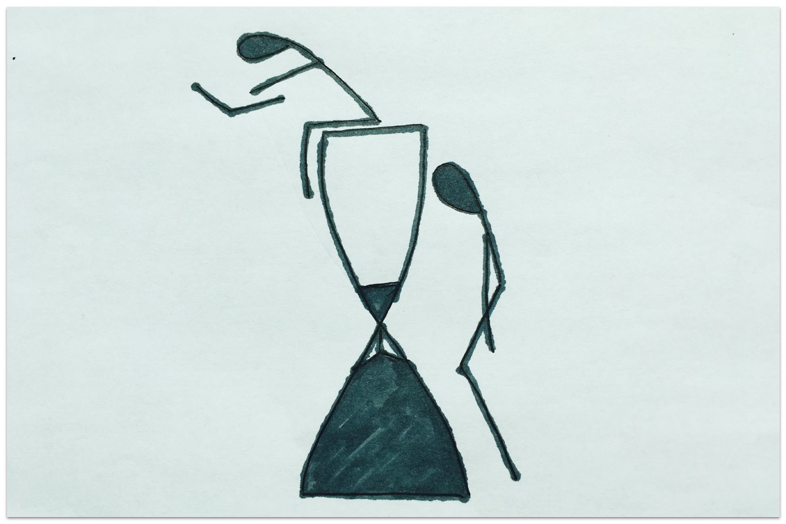
During the initial brainstorming sessions, we discovered research documenting the detrimental effects of sitting or standing for long periods of time. We found that the act of sitting or standing wasn’t the main problem. Long periods without short breaks in between were causing the most negative health effects for both sitting and standing. We found the problem serious enough to warrant a solution, so we formed our initial goal.
Goal: help users interrupt long periods of sitting or standing with a short break.
Audience
To begin user research, we constructed an online survey to quickly capture some user data. We then supplemented that research with face-to-face user interviews. Both methods targeted quantitative and qualitative data and we we targeted topics like:
- daily activities
- postures
- habits
- overall smartphone use
- awareness of sitting and standing behavior
- knowledge of health effects
- willingness to modify behavior using a smartphone application
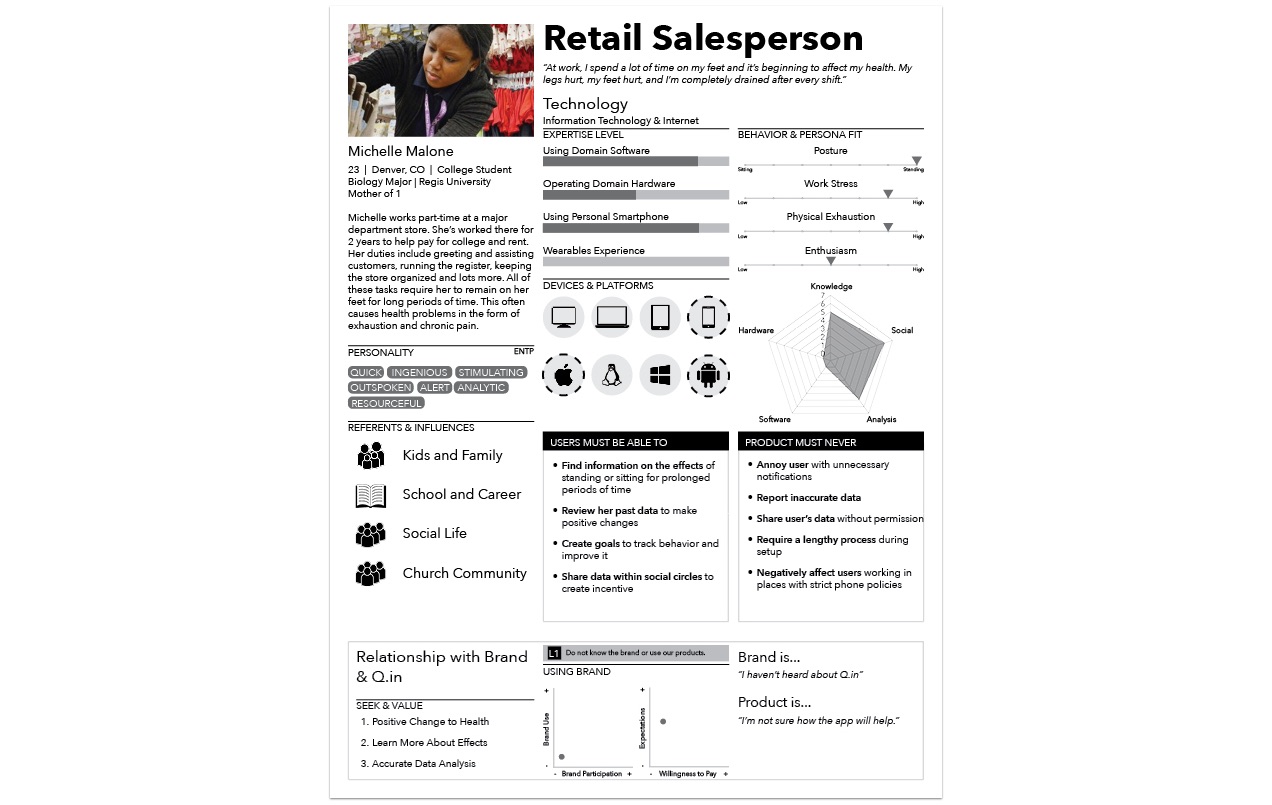
The research pointed us toward two potential user segments worth helping, 1) people who spent too much time sitting, and 2) people who spent too much time standing. Due to a technological constraint that will be detailed in a later section, we focused on the standing segment because we knew we had the resources to help them more. These users owned smartphones and primarily carried their phone in a pant pocket. Research showed how some participants placed their phones in purses, shirt pockets, or carried them in hand, but those that stood most tended to carry their phone in a pant pocket. We used the retail salesperson archetype to personify the data we found.
Team / Role
In a team of 5, we all carried multiple responsibilities. We met numerous times throughout the week and communicated our own personal goals as well as our vision for the project. We brainstormed and listed the responsibilities the project would require. As the lead, I asked my teammates to take on two primary responsibilities they were interested in most. I chose UI/UX as my second responsibility.
Every member of our team was enrolled in the Human Computer Interaction (HCI) graduate program at ISU. This program focused on gathering HCI researchers from multiple disciplines. In a team composed of diverse minds, I understood how our team would face several communication issues. I addressed these issues by incorporating Jesse James Garrett’s Elements of User Experience into our communication. Before constructing a single wireframe, we adopted a common language to begin and end on the same page.
Constraints
A lack of technological resources played a major role in our ultimate design. We considered designs that incorporated wearables, but unfortunately none of us on the team had access to the technology yet. We decided to work with the common smartphone’s capabilities so we thought of exploiting the device’s accelerometer to determine the the user’s posture. If the smartphone was horizontal or near horizontal, the application would count the time in that position as sitting. If the the smartphone was vertical or near vertical, the application would count the time in that position as standing.
To make this design happen, we had to target users who owned smartphones and primarily carried their phones in a pant pocket, thus compelling us to select users that stood a lot. The persona above summarized the user research and constrained the project sufficiently enough for me to begin UX/UI design work.
Design Process
Adaptive Path’s Sketchboard Technique
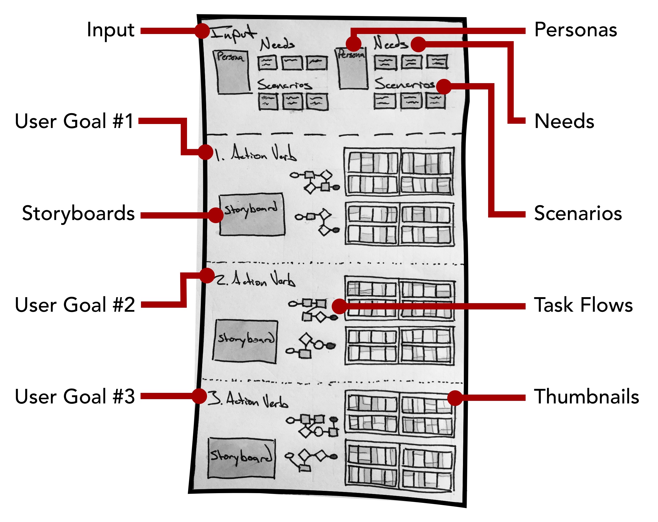
Like the OmniScribe case study, I employed a combination of methods during the entire design process. Adaptive Path’s Sketchboarding method provided me with an invaluable macro-perspective. By helping me understand where everything fit, I could focus on designing the smaller details without losing sight of the bigger picture. For more details on Sketchboarding, please check out Adaptive Path’s article on the design method. The Sketchboarding method’s versatile nature gave me the freedom to combine design methods that made sense for different stages of the design process.
User Research
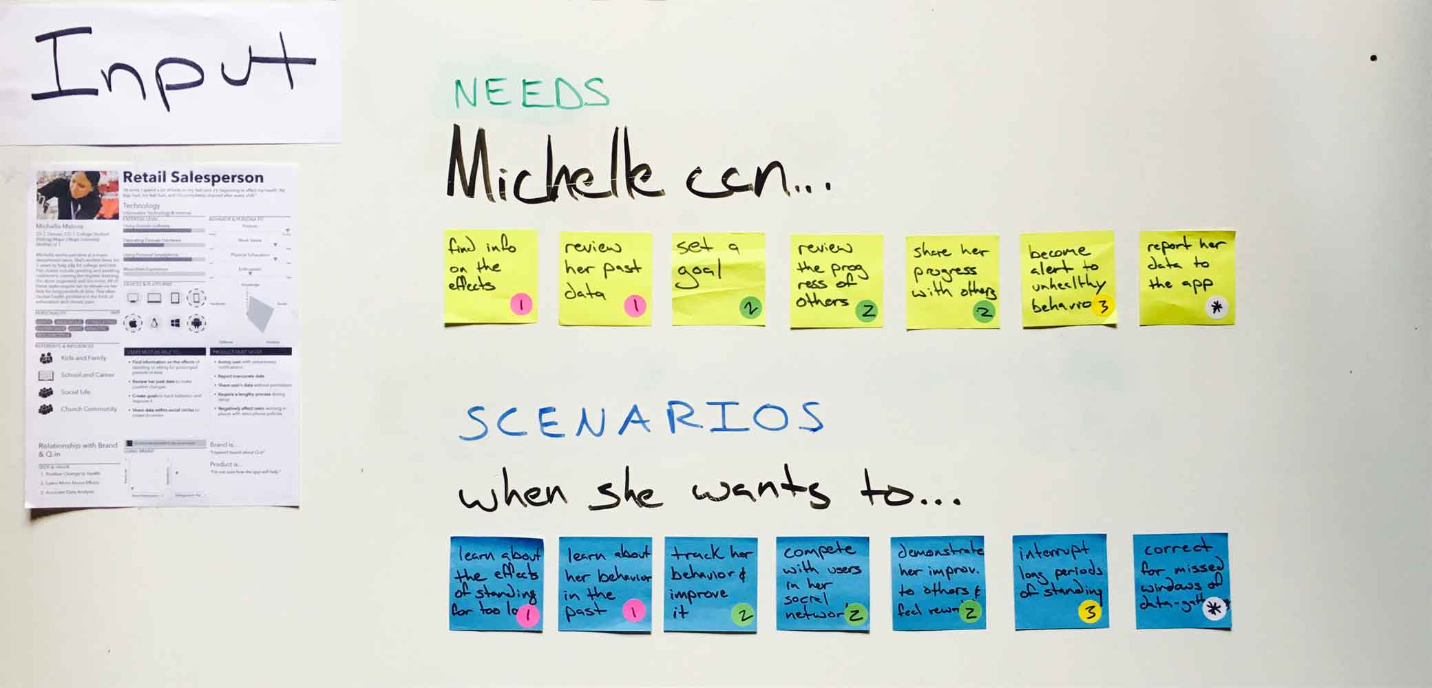
Michelle’s persona, along with a list of user needs (top 7 stickies) and scenarios (bottom 7 stickies), made up the Input section, a section intended as a quick reference while sketching. I used a complete English sentence to frame how the needs and scenarios fit together.
For example…
She can set a goal (need) when she wants to track her behavior and improve it (scenario). Mentally, I could quickly ask myself, ‘how might Michelle set a goal when she wants to track her behavior and improve it?’
I used the following three category labels to cover the needs and scenarios required by our persona. These broader categories helped me compartmentalize the problem.
Users need to…
- Learn about current postural habits (pink dots).
- Set goals for improving those habits (green dots).
- Interrupt long periods of standing (yellow dot).
User Goals
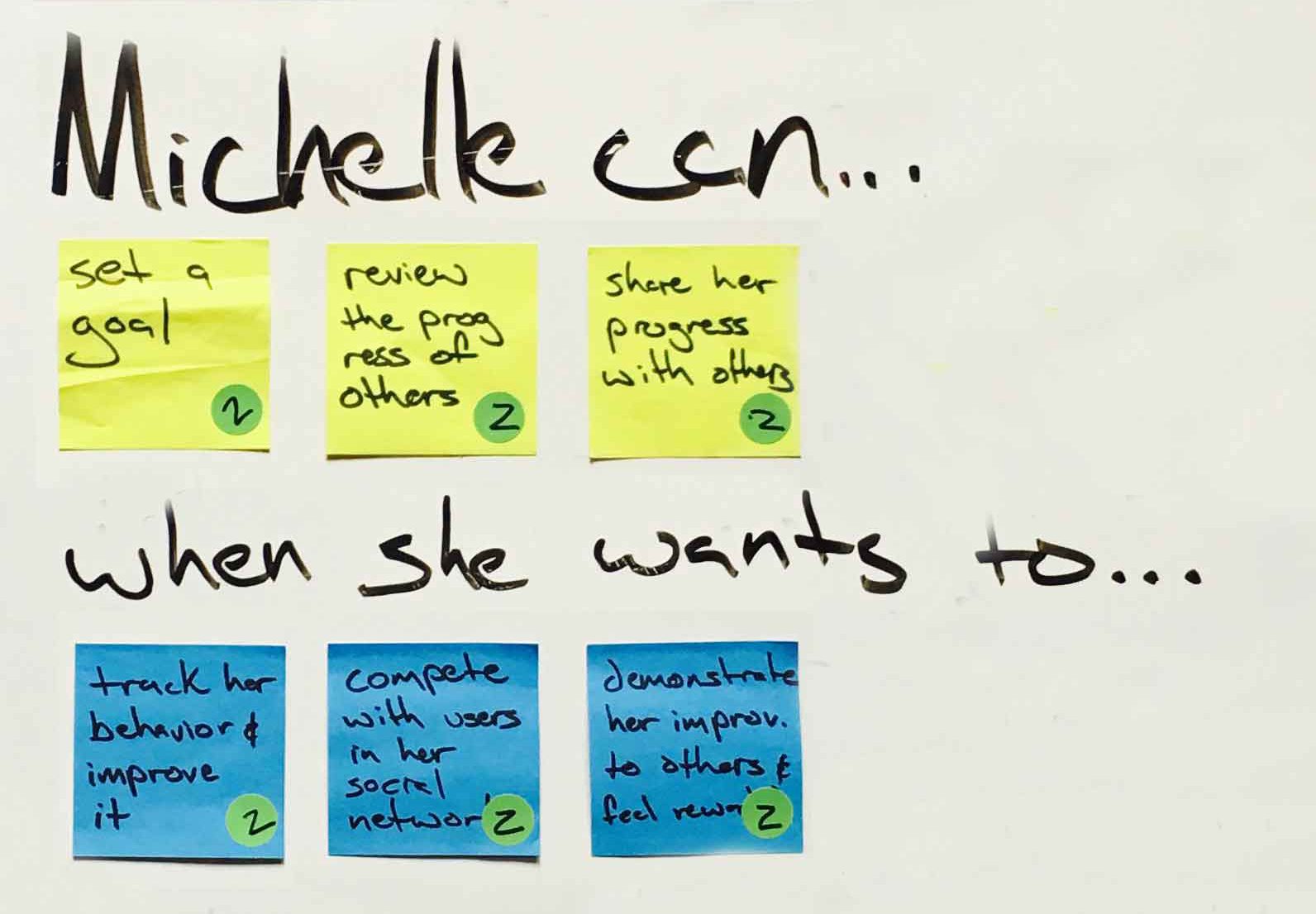
I would like to discuss the needs and scenarios in the second category shown above in greater detail to give a concrete example of the interaction design. Here’s how our user might set goals to improve postural habits.
Storyboard
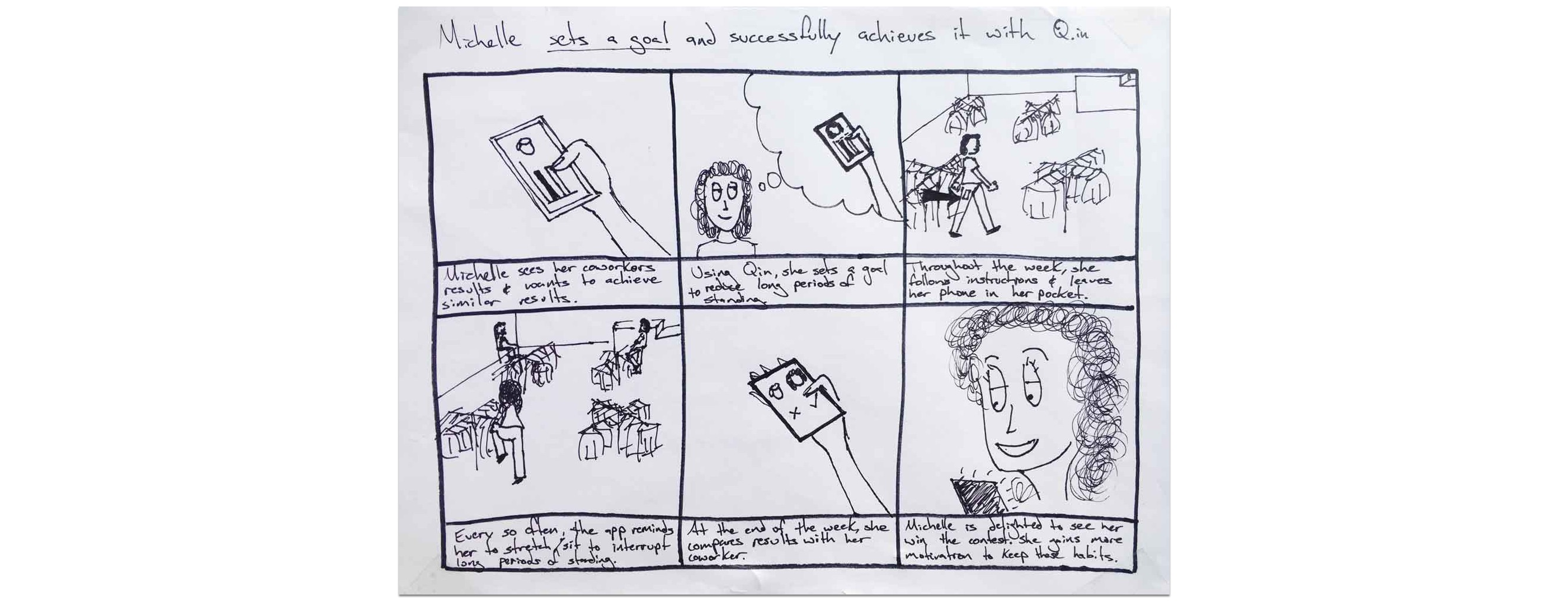
To begin designing interactions that helped Michelle set goals for improving her habits, I used a storyboard to quickly demonstrate why Michelle may need to accomplish her user goal. This served as a visual reminder to help me remember the idea behind her goal. The storyboard gave the user scenarios life.
User flows
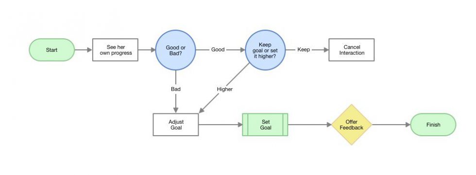
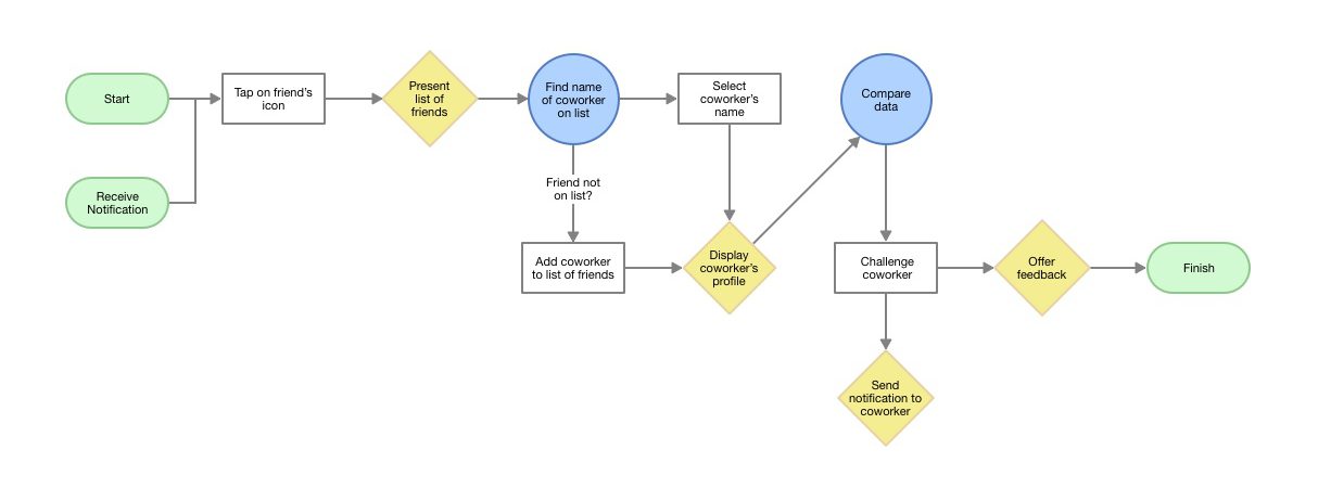
Once I had a strong empathetic mindset in place, I mapped out several ways the UX could support the needs and scenarios specified by the input section. Using a user flow diagram, I drew out ways the user could begin and end their task successfully. This exercise focused on how the user might accomplish a task. The map helped me understand how my users might model a specific task in their head.
Thumbnails
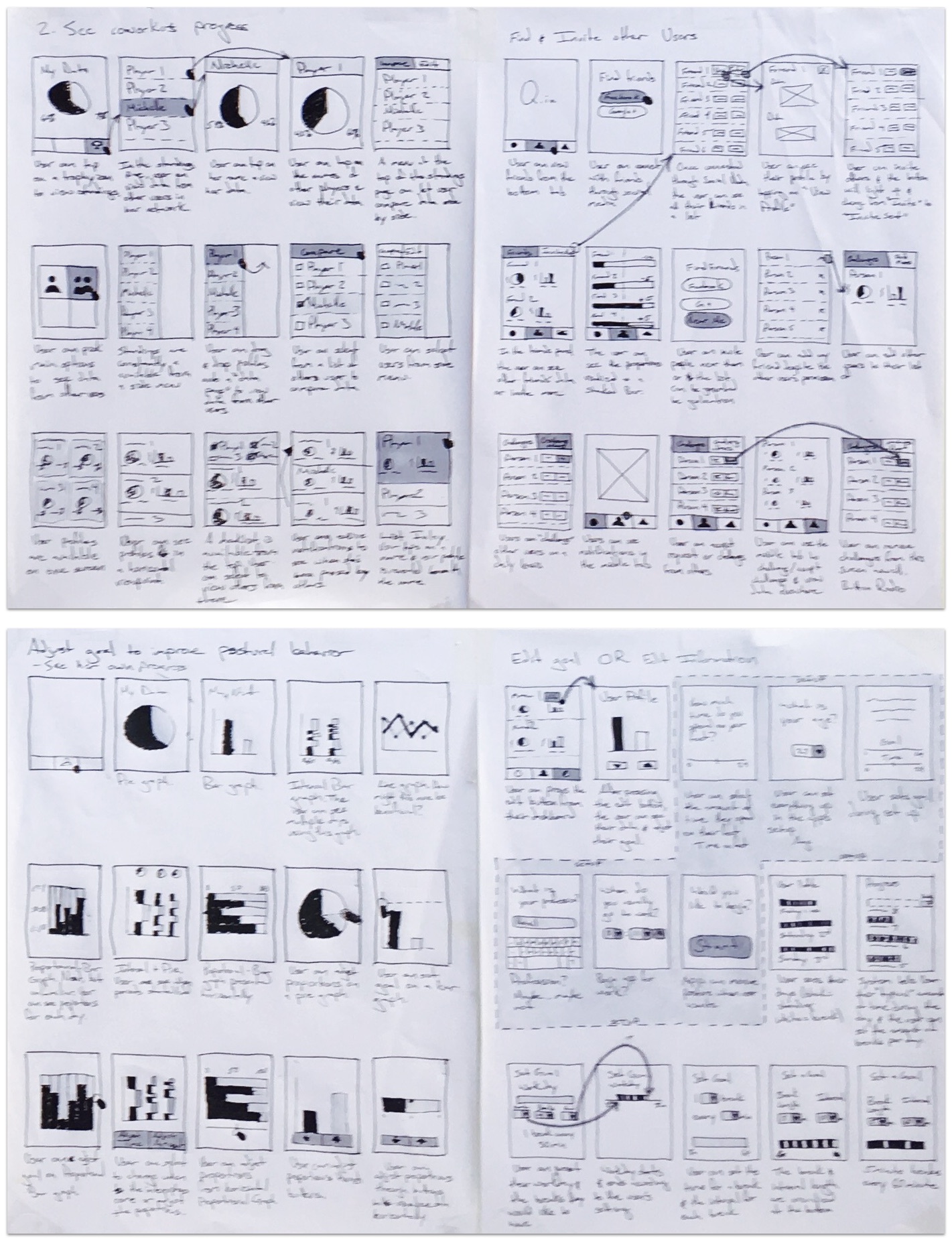
From the user flows, I began sketching UI design ideas in the form of thumbnails. The thumbnail method allowed me to develop many different ideas and cover the various ways my users set a goal. At this stage, I spent a lot of time sketching different layouts for presenting all the information the user would need. This exercise focused on what the user might see and where the user might see it on a screen as they accomplished a task. A small description beneath each thumbnail helped me remember the main idea behind each sketch.
Wireframe
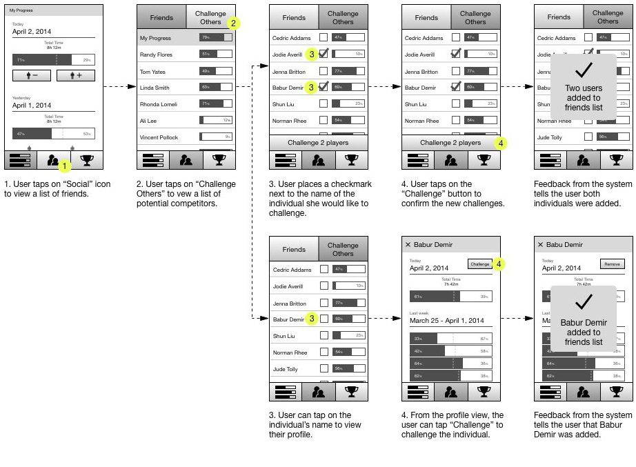
From the large list of thumbnails, I selected the most promising ideas to support tasks. This stage often benefits from other eyes, so I would bring in the rest of the team for input. We selected the ideas that made the most logical sense based on the research and our intuition. By converging down to a few ideas, I was able to work through a logical sequence of interactions in the form of a wireframe.
Paper Prototype
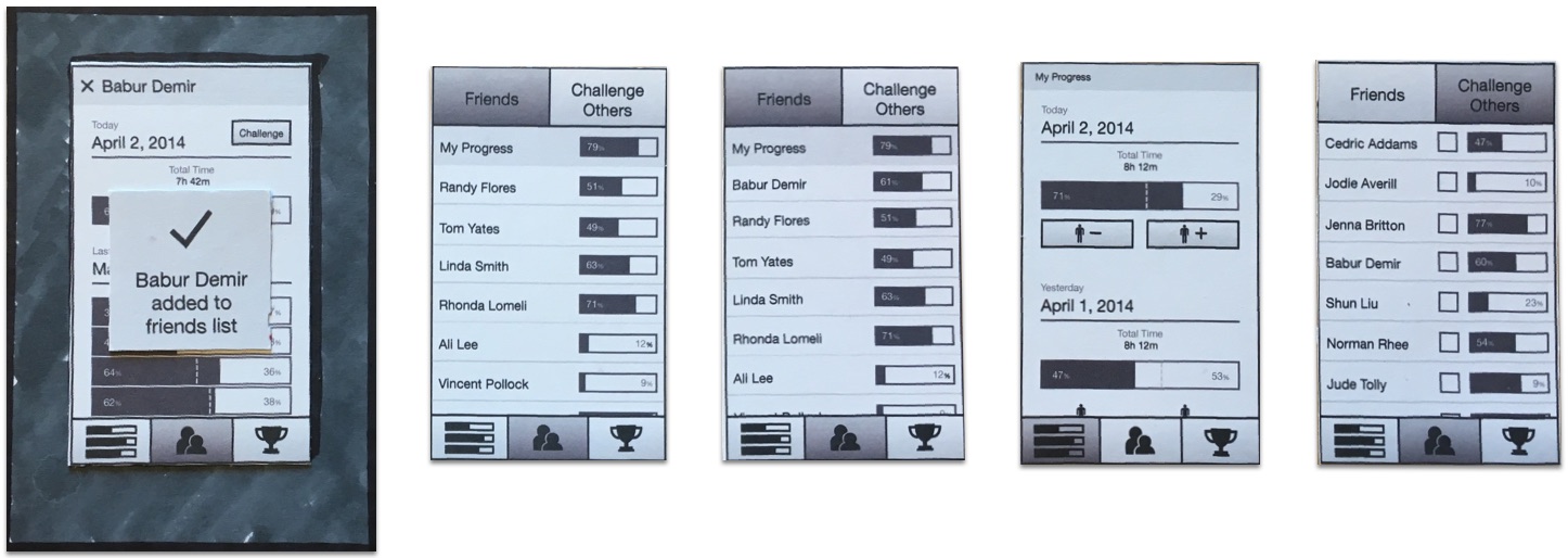
We didn’t have a lot of time to make an interactive prototype so we made a few paper prototypes to test our ideas. The above paper prototype was the latest iteration used to test more specific questions in medium fidelity. Earlier prototypes were of a much lower fidelity.
Testing
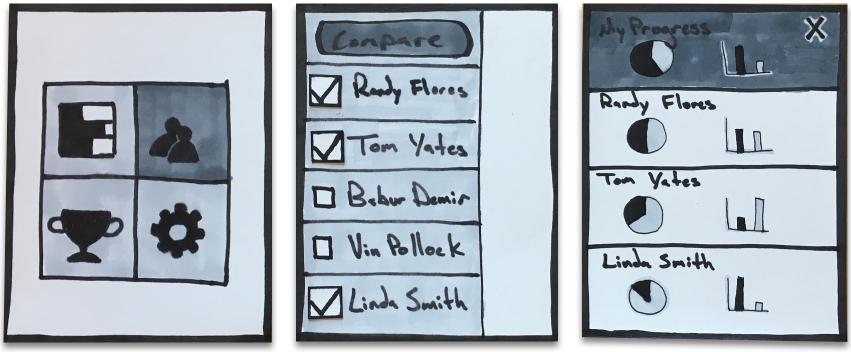
The above prototype was one of the first iterations to be tested with users. The design primarily failed when users were asked to find the data belonging to other users. Many users selected the “bar graph” icon on the top-left in the first screen to accomplish this task. From the results, we decided combine the social and data aspects of the design so users could compare all data from one place.
High-Fidelity Composition
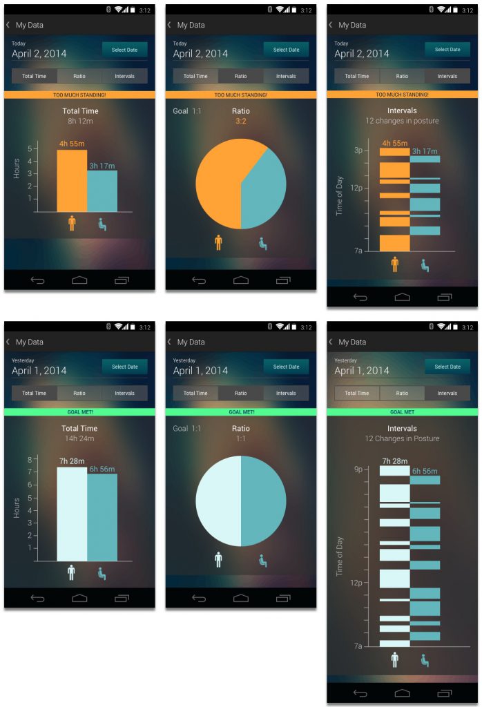
I made the comp above based on an earlier prototype. The information design was a little confusing for some users when we tested it. Many were unfamiliar with the odd stacks of data because they had never seen that design before. After spending hours on the comp only to scrap most of it, I learned the importance of spending just enough time on a prototype to answer the design questions. I probably could’ve arrived at similar results with a composition containing less detail, thus saving time.
Retrospective
Design follows research
When we brainstormed initial ideas, we were armed with zero user research. We scouted for problems based on our own personal experiences. In other words, we tried to find the problems that only bothered us. By starting with zero user research, we introduced the critical mistake of projecting personal experiences onto users by assuming they experienced the same problem. A lot of great inventions can still be developed this way, but not without running the high risk of solving a problem nobody else cares about. I think the CHI Student Design Competition committee would agree because we didn’t get passed the first round of eliminations. Embarrassing, I know.
When we learned of the detrimental effects of prolonged periods in one position, we immediately began brainstorming solutions without asking anyone else how they experienced these effects. Yeah, we had traditional research like articles and study results, but the user research didn’t come until we already had a solution in mind. What’s the point of conducting formative user research if you’ve already formed the solution beforehand? In this project, we fell into a classic trap of confirmation bias. We designed a solution before we completely understood the problem and I’ll be sure not to repeat this approach in the future.
